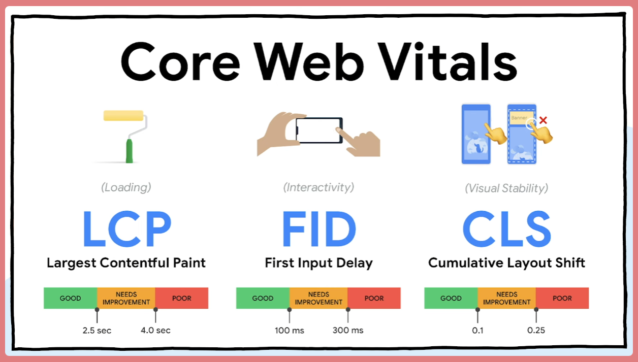
Forecast future SEO risks by combining alerts with data science
03/03/2026
—
Samir BELABBES
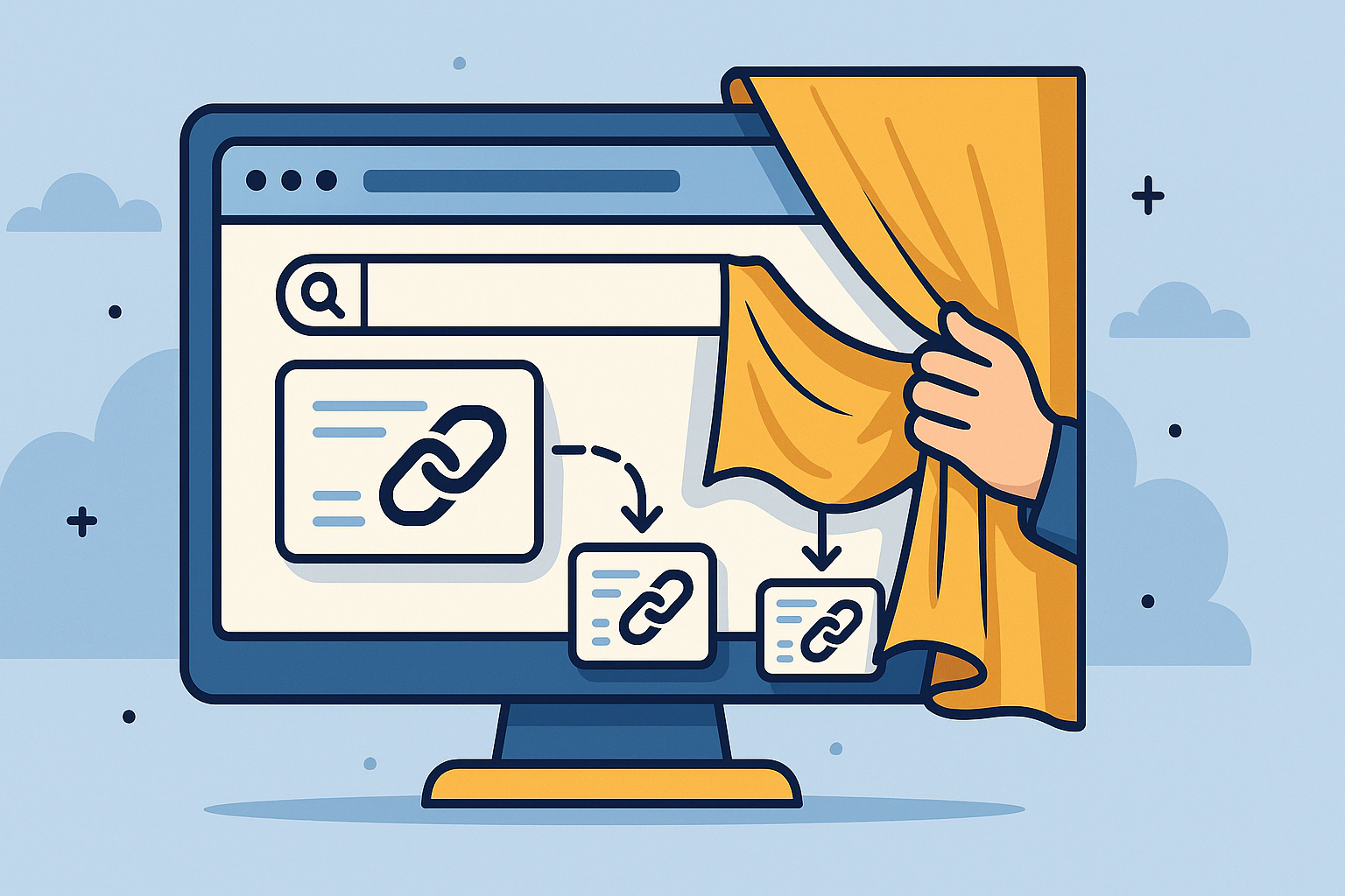
Affiliate de-cloaking : how to discover affiliate violations
08/12/2025
—
Samir BELABBES
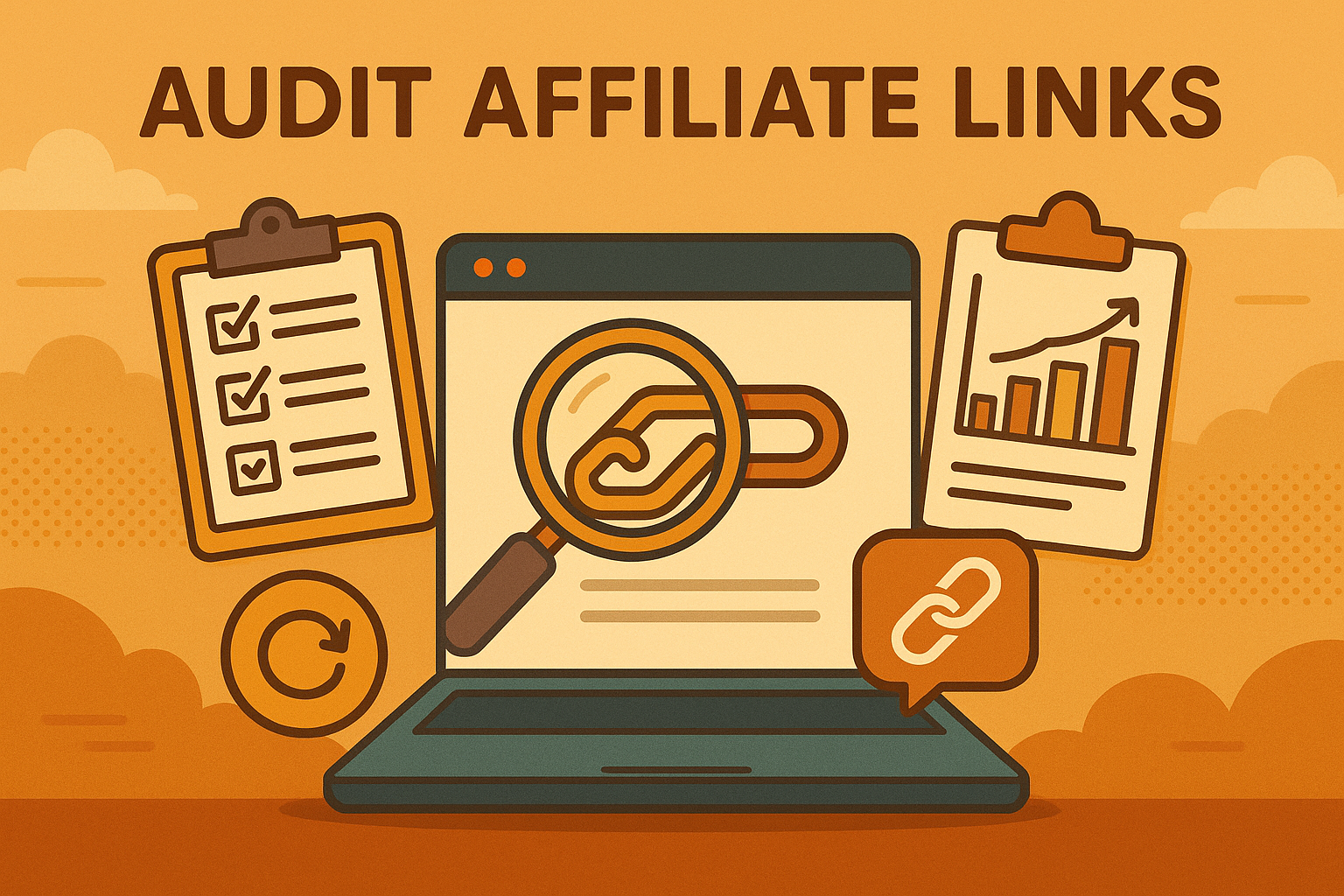
How to audit affiliate links : a complete guide for marketers
01/12/2025
—
Samir BELABBES
Reddit SEO in 2025: How to use Reddit for link building & traffic
04/10/2025
—
Samir BELABBES